Globes are pretty rare in classrooms these days. Often instructors use the rough 2-dimensional equivalents, i.e. maps.
Take a look at a world map sometime. Compare Canada and Africa. Look about the same size? They aren't even close. Africa is much larger; three times in fact.
I want to give students a chance to experience how disproportional these maps really are.
I would have students create their own maps on Google. Then I would have them look at the maps, and guess which one is larger and by about how much. I would have them encircle Canada, and Africa using the shapes tool; it tells the editor what the area and edge length of the shape is. Similar to what I have done below.
The difference will surprise them. Even though Canada's coastline is only only marginally larger (less than 50%) it will take them significantly more time to encircle it.
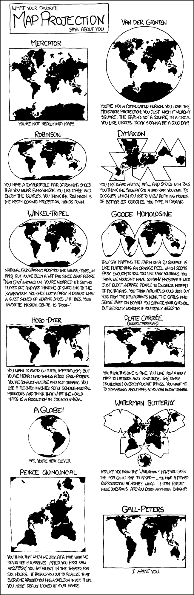
I can then hit home the experience with one of these.
OR
XKCD
No comments:
Post a Comment